Jeremy Fisher Portfolio
New Maps Plus + Independent Projects
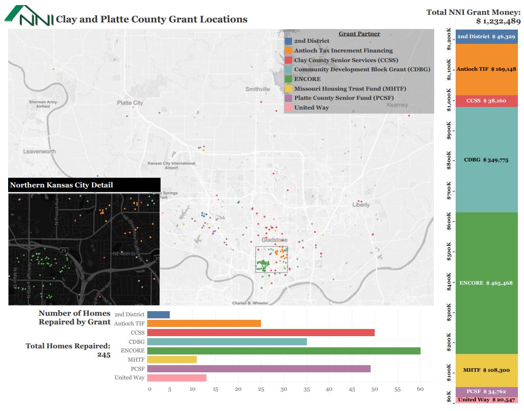
NNI Grant Locations from June 2018 to May 2019
Tableau Dashboard with locations of grants, symbolized by grant partner. Two graphs included to give a better overall impact of the grants as a whole.
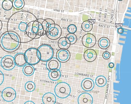
Bike share use by station from July-September 2016.
Data sorted into hour blocks. Enables the user to change the hour with a slider in order to see the changes in trips beginning and ending at each station throughout all 24 hour blocks.
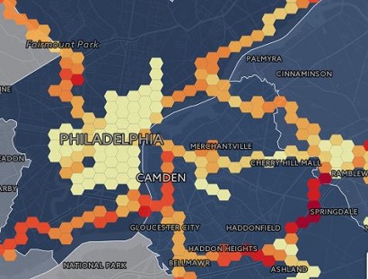
Figured out that my car insurance company gathers interesting data about my driving. I decided to make a map using the data from about 5 months of my personal driving history.
I used point in polygon analsis to display where I drove most frequently, and to display the average speed with small hexbins.
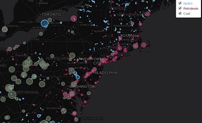
Created a bivatiate map displaying the location of coal, petroleum, and hydro power plants and their plant's capacity for each.

This is a hexbin map dislaying the density of Breweries in North America. Boulder, CO was an area with a high number of breweries, which is displayed in the inset map.